My Role
As the lead designer, I guided the platform redesign from research through delivery, collaborating closely with cross-functional teams to translate strategy into a cohesive digital experience.
I partnered with Blink on early research to understand educator needs and helped turn those insights into user journeys, information architecture, and wireframes. I also defined the UI approach that guided the design system, ensuring visual consistency and usability throughout the platform.
Throughout the process, I worked hand-in-hand with engineering to maintain design quality and scalability, mentoring designers and establishing guidelines that supported long-term growth.
Problem to Solve
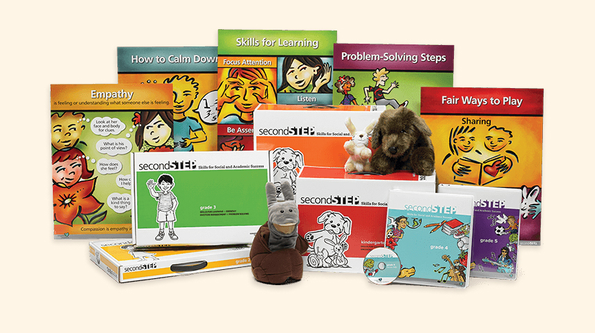
Second Step’s programs had grown into multiple disconnected products that varied in format, delivery, and user experience. Elementary educators used print-based kits with DVDs and binders, while Middle School teachers accessed a separate digital platform. The result was a fragmented ecosystem that left teachers managing siloed content and inconsistent flows across programs.
With limited time and competing priorities, teachers felt overwhelmed having to learn the SEL lessons and teach them confidently. Without a clear, unified experience, preparing and delivering lessons became time-consuming and difficult to sustain.
The challenge was to bring these programs together into a single, scalable digital platform that supported both kit-based and digital-first experiences, creating an experience that felt cohesive, intuitive, and empowering for teachers.
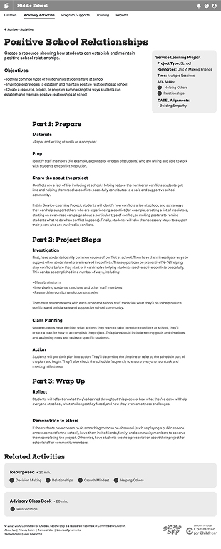
Elementary Classroom Kits
Print-based kits required manual setup and organization, making lesson preparation time-consuming.
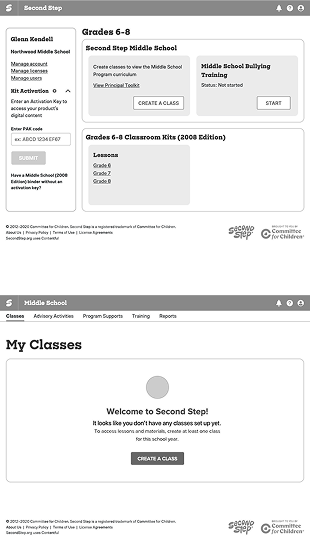
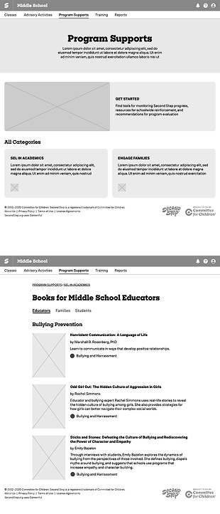
Middle School Digital Program
The digital platform was outdated and unintuitive, creating friction for teachers when preparing and teaching lessons.
Research & Insights
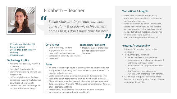
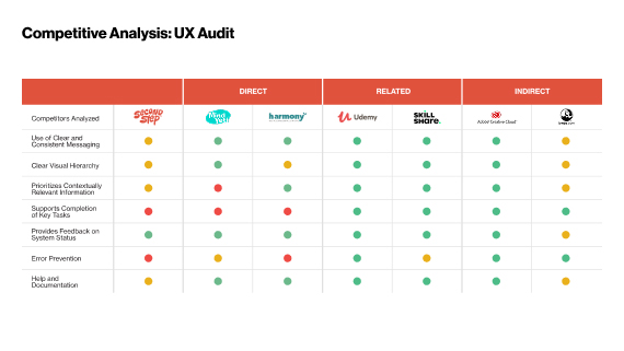
To ground the work, we partnered with Blink for early research and strategy. Through workshops, interviews, and competitive analysis, we uncovered how teachers interacted with Second Step and where the experience fell short.
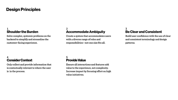
Blink also helped us define design principles that shaped our process and guided every decision, ensuring the experience felt focused, intuitive, and grounded in real classroom use.
Key Insights
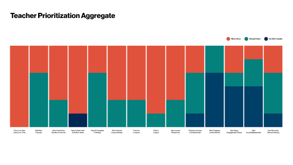
Teachers valued ease and reliability above all else. They wanted to log in, find their lessons, and teach without friction.
Blink’s mental model and persona work helped us align around that core need that teachers just want to teach and gave us clear direction for simplifying the journey.

Process
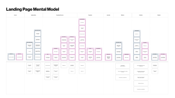
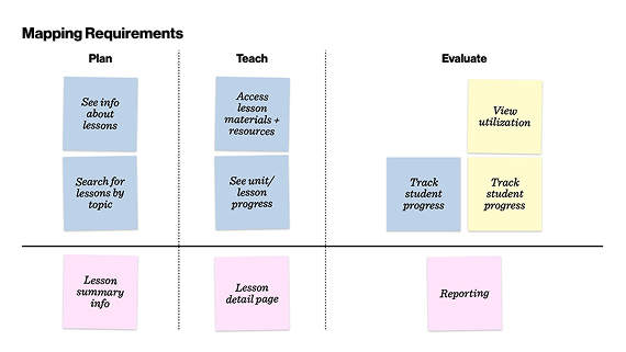
As we moved into design, we approached the platform as a connected system rather than a collection of separate products. Each Second Step program had its own needs, but the goal was to create a unified structure that teachers could quickly understand and trust.
We focused on building a global framework that could scale with new programs while maintaining clarity and consistency across the experience. By mapping content to teacher goals, from preparing lessons to teaching and tracking progress, we defined an architecture that guided users naturally through their journey.
The result was a streamlined system that supported both digital and kit-based programs through shared navigation, consistent labeling, and clear pathways for action.


Testing Navigation for Clarity and Confidence
With the framework in place, we explored navigation models that supported how teachers naturally move between lessons, training, and resources. Two primary approaches emerged, a top-bar navigation and a left-drawer layout.
Usability testing revealed that teachers preferred the top-bar model, achieving a 77 percent task success rate compared to 60 percent with the drawer. The persistent layout provided a stronger sense of orientation, helping teachers stay confident as they switched between programs and classes.
Option 1: Top Bar Navigation
Clear, persistent layout that improved orientation and task success during testing.
Option 2: Drawer Navigation
Collapsible layout that provided flexibility but reduced clarity and wayfinding confidence.
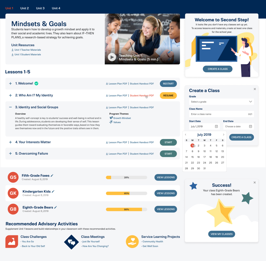
Establishing the Platform Foundation
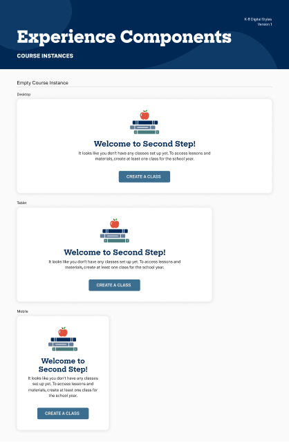
Once navigation patterns were validated, we translated them into mid-fidelity wireframes to define layout and hierarchy across key screens. These wireframes established the foundation for the educator dashboard, class management, and lesson preparation experiences.
Working at this fidelity allowed us to iterate quickly, validate information placement, and confirm clarity before moving into visual design. The result was a set of wireframes that captured the structure and intent of the platform, ready to evolve into a unified, scalable interface.
Defining the visual language
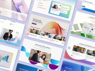
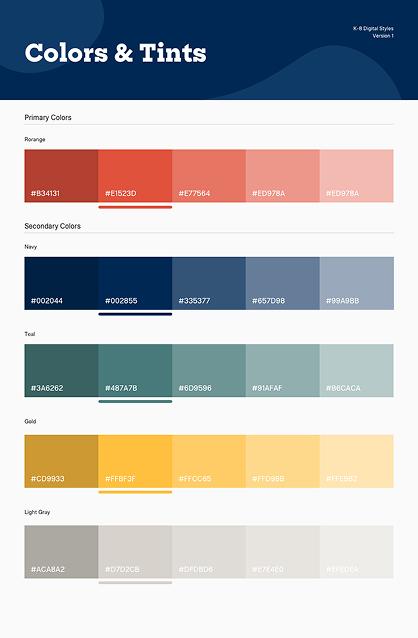
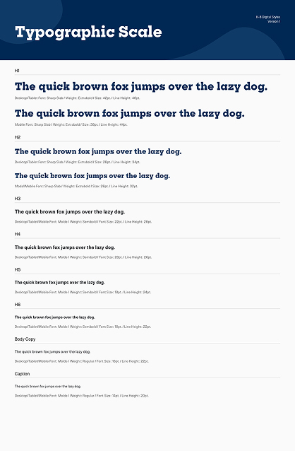
With the structure in place, we explored how the Second Step brand could come to life within the digital interface. The goal was to create a visual language that felt warm, structured, and balanced, reflecting the program’s focus on empathy and emotional growth while supporting clear, task-focused interactions.
I created a series of element collages to explore directions for color, typography, and tone. Each concept showed how brand elements could enhance the interface while keeping the focus on usability. After review with key stakeholders, the chosen direction became the foundation for a cohesive visual system that balanced brand expression with accessibility and ease of use.
Solution
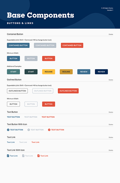
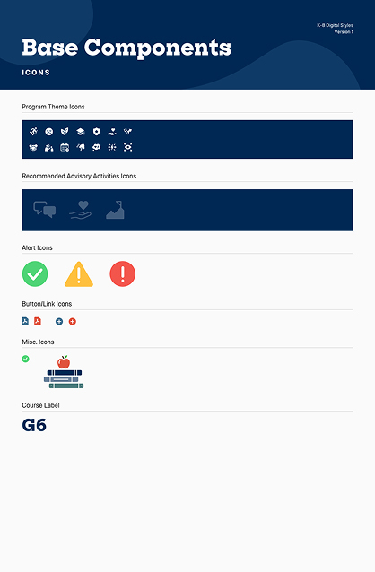
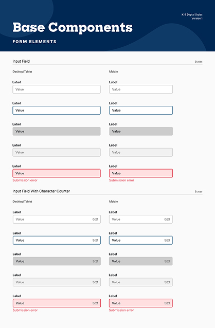
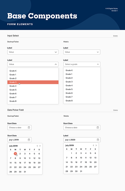
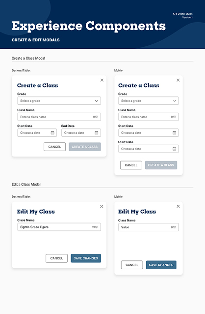
With the visual direction approved, I defined the components and interaction patterns that brought consistency across the platform. The goal was to create a system that simplified design and development while remaining flexible enough to support future Second Step programs.
Each component was built to account for multiple states and use cases, ensuring visual and behavioral consistency across dashboards, lessons, and training modules. Documenting patterns early gave the team a shared language that streamlined collaboration and accelerated delivery.
A Unified Experience
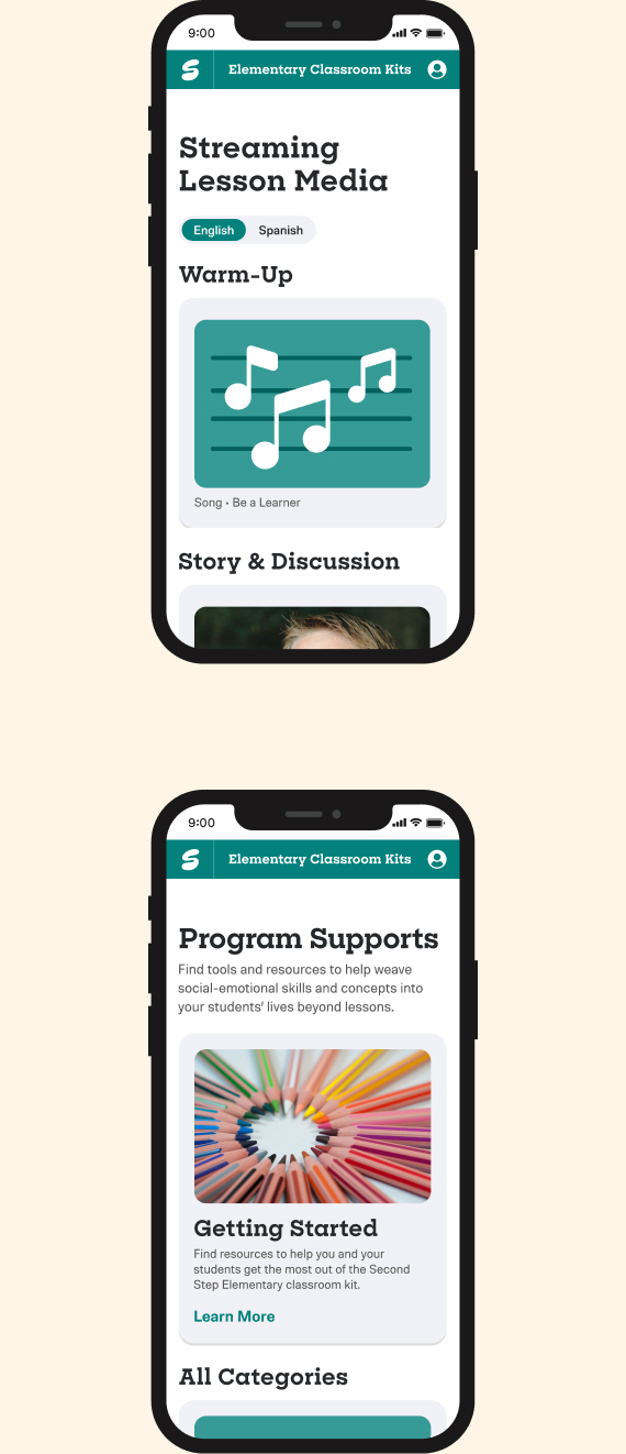
The final interface brought the system to life across desktop, tablet, and mobile, creating a unified experience that supported teachers wherever they worked. The design emphasized clarity, hierarchy, and ease of use, helping educators teach with confidence and focus on what mattered most, their students.
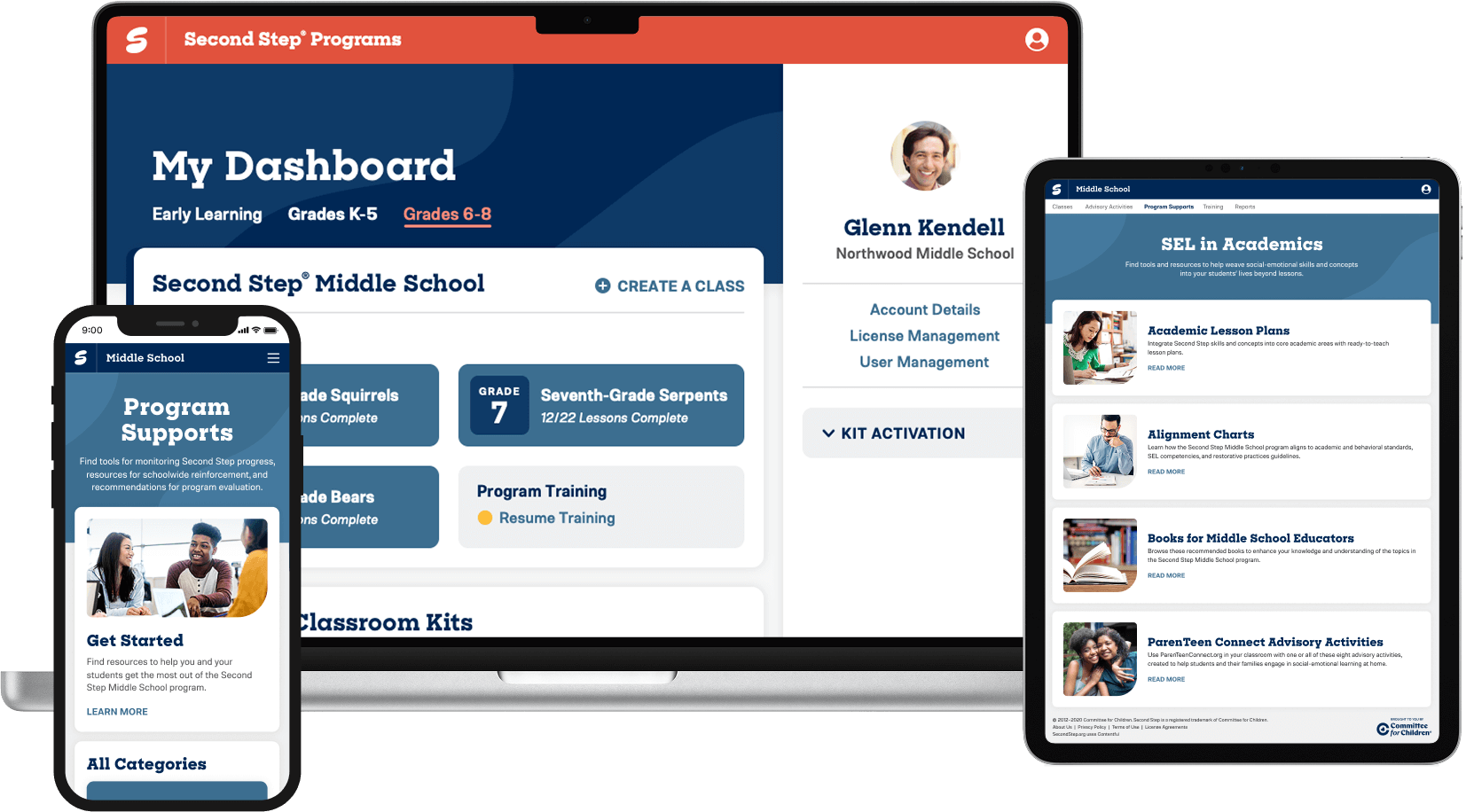
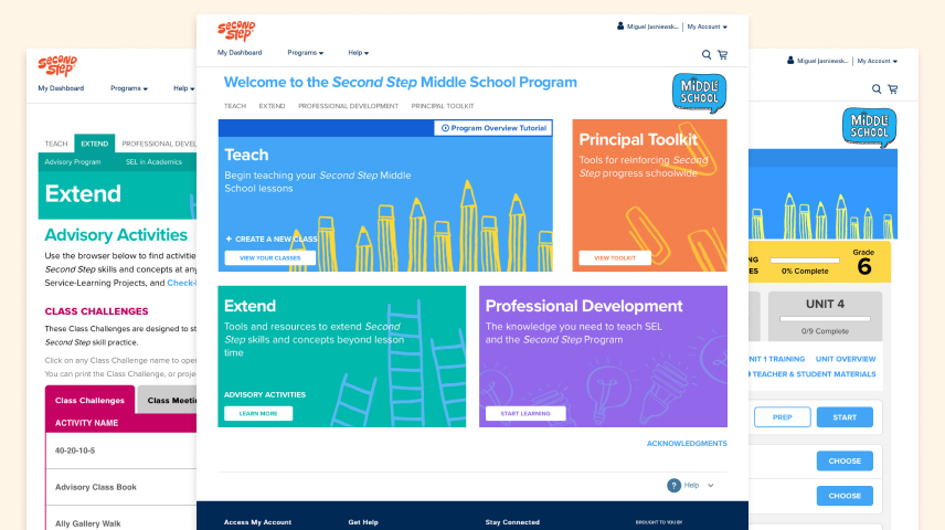
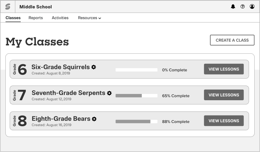
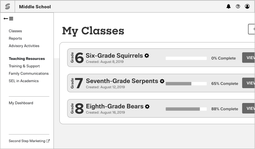
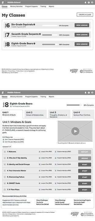
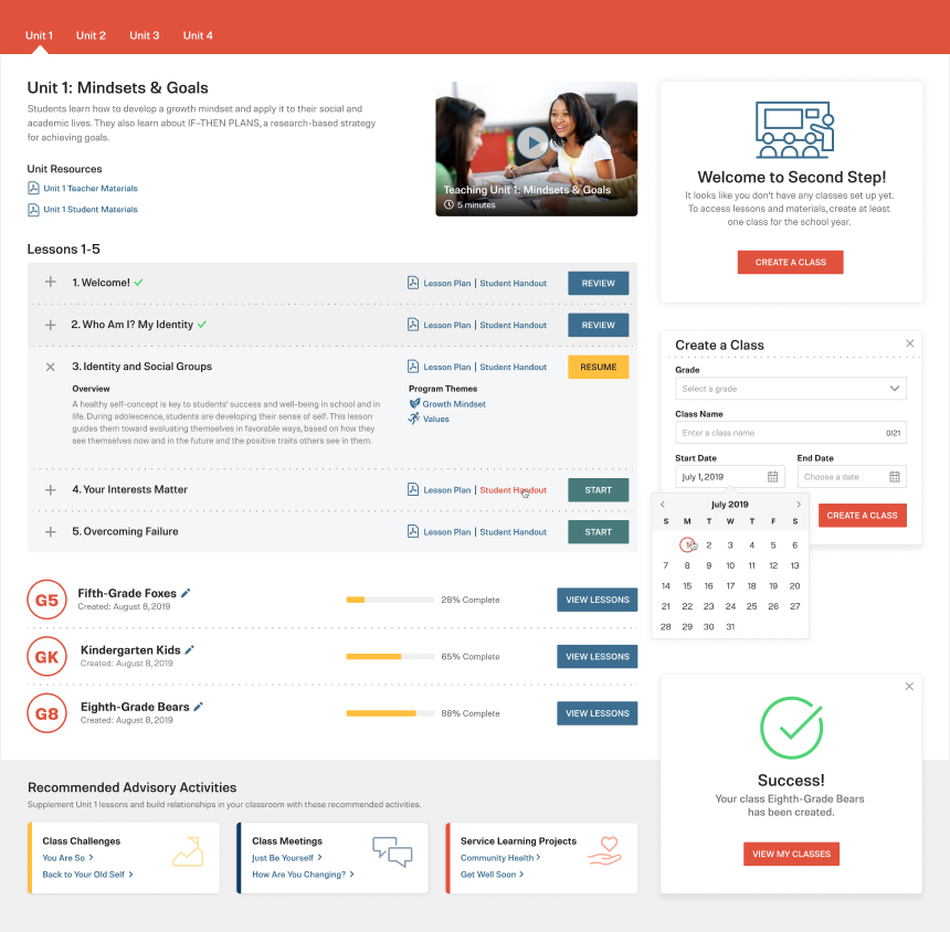
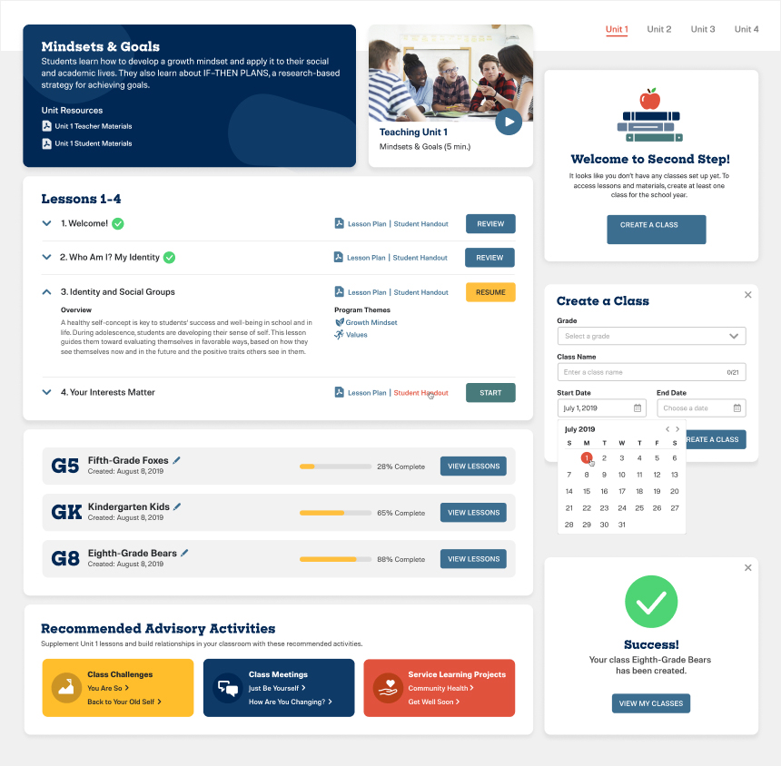
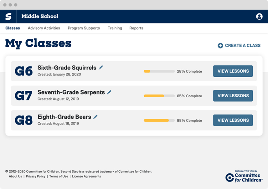
Middle School Landing
Designed as the teacher’s home base, the landing page gives a clear overview of active classes with progress indicators and quick actions. Its structured layout and simplified hierarchy reduce cognitive load, helping educators move confidently between classes and lessons.
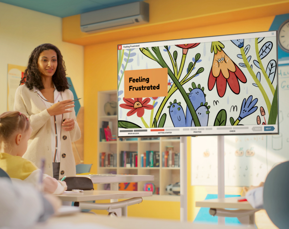
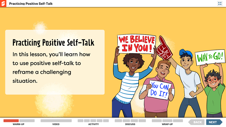
Lesson Player
The media-rich lesson player brings interactive slides, videos, and activities into the classroom. Designed for teaching in real time, it keeps attention on instruction with clear hierarchy, large type, and consistent controls. Teachers can stay present with their students and focus fully on the lesson experience.
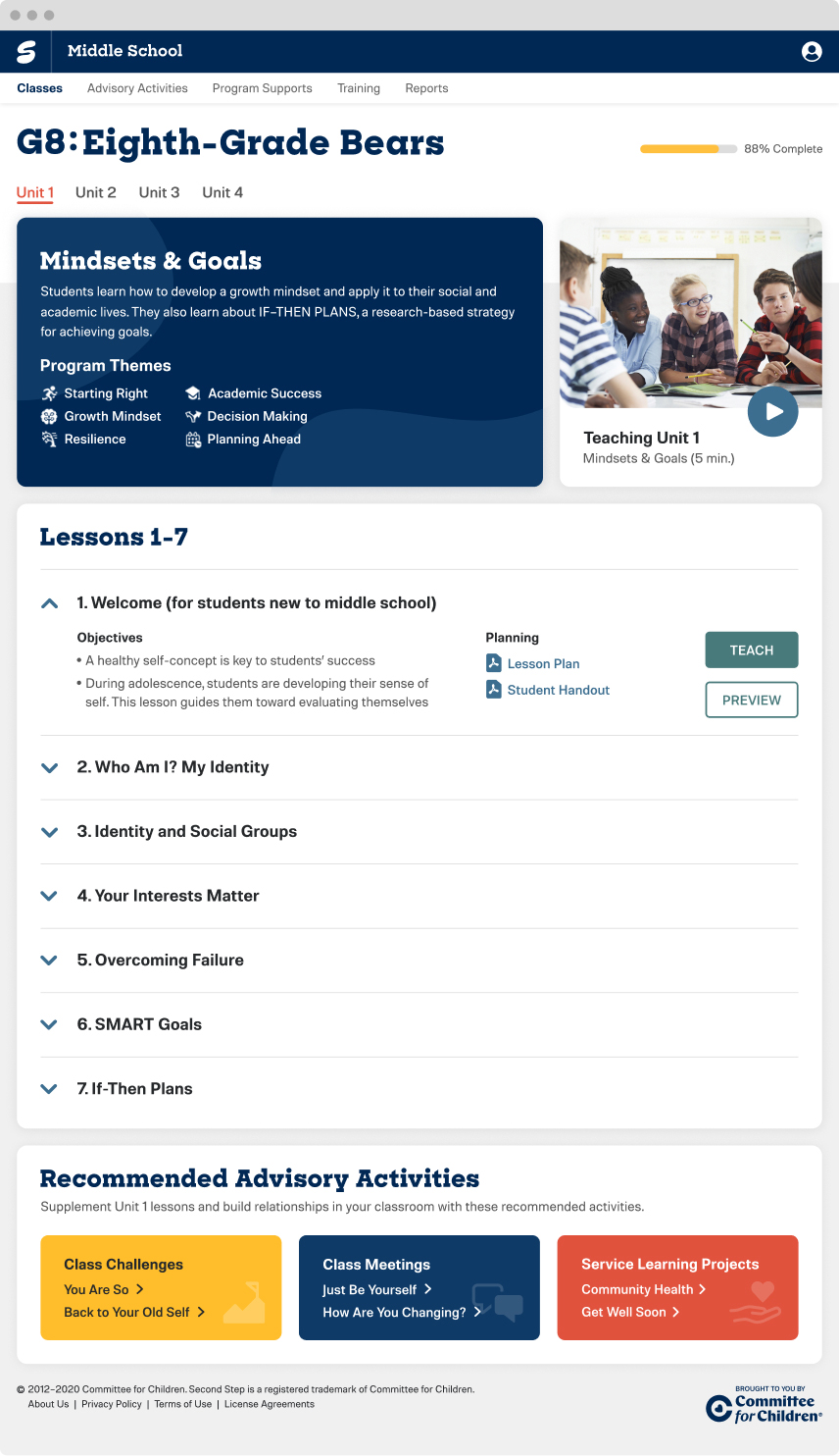
Lesson Detail
The lesson detail page brings clarity to preparation and delivery. Teachers can quickly see objectives, timing, and materials, while clear actions like Preview and Teach create a sense of confidence and control before entering the lesson.
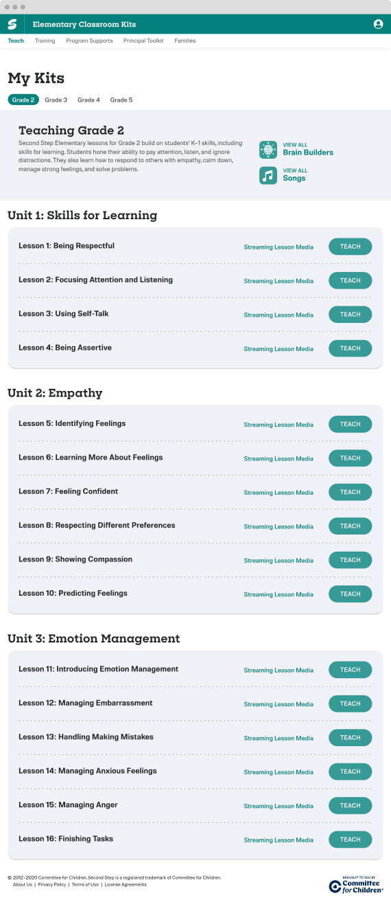
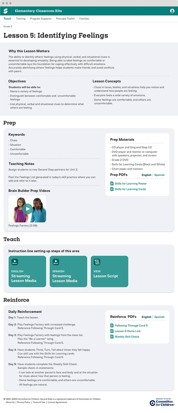
Bridging Print and Digital
For K–6, the focus was on bridging the gap between print-based kits and digital access. While the design system was created for Middle School, the same visual principles were applied to maintain consistency across programs. Teachers could activate their kits, stream lesson media, and access resources with the same clarity and structure that defined the digital experience.
Impact

Unified the Experience Across Programs
Established a consistent design framework across all Second Step programs, creating a cohesive experience throughout the platform.

Empowered Teachers in the Classroom
Simplified lesson preparation and delivery, giving teachers more time and confidence in the classroom.

Aligned Teams Through a Shared System
Developed a shared component library and documentation that brought consistency to how teams designed, built, and maintained the platform.

Built a Foundation for Future Growth
Created an extensible foundation that could evolve with new programs, ensuring the platform could scale with minimal redesign.