Uniting cross functional teams through a cascading design system
The parent library of the design system contained globally used components such as typography, colors, spacing, and layout. This approach meant that by adding, removing or changing an asset in the parent library, all other UI libraries would consume that exact same change. This mirrored how the design system is implemented in code to ensure that a unified user experience would occur as the system evolved.
Creating key design principles to provide a solid foundation
At the start of the project, working as a team through multiple iterations, we developed and established a set of design principles. The principles helped establish a framework for all decisions made as Second Step was developed.
Defining patterns to unify a shared language
It was important to define patterns early in the design process. Based on key user journeys, I conducted an audit of all components, patterns, and features. Working with both designers and developers I defined final naming conventions and categories. By establishing this shared language, it made designers and developers work together and prevented duplication as the products evolved.
Aligning the design of the app to the Second Step brand
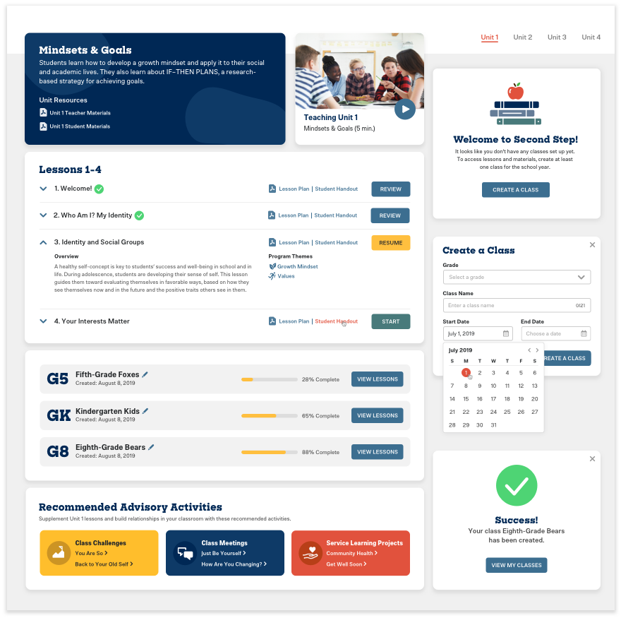
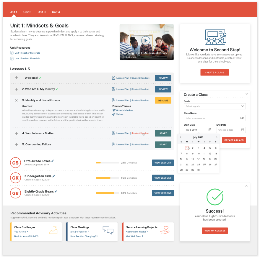
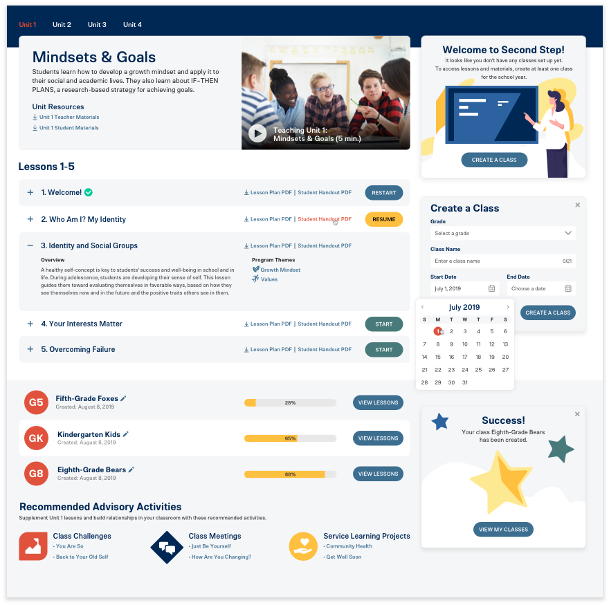
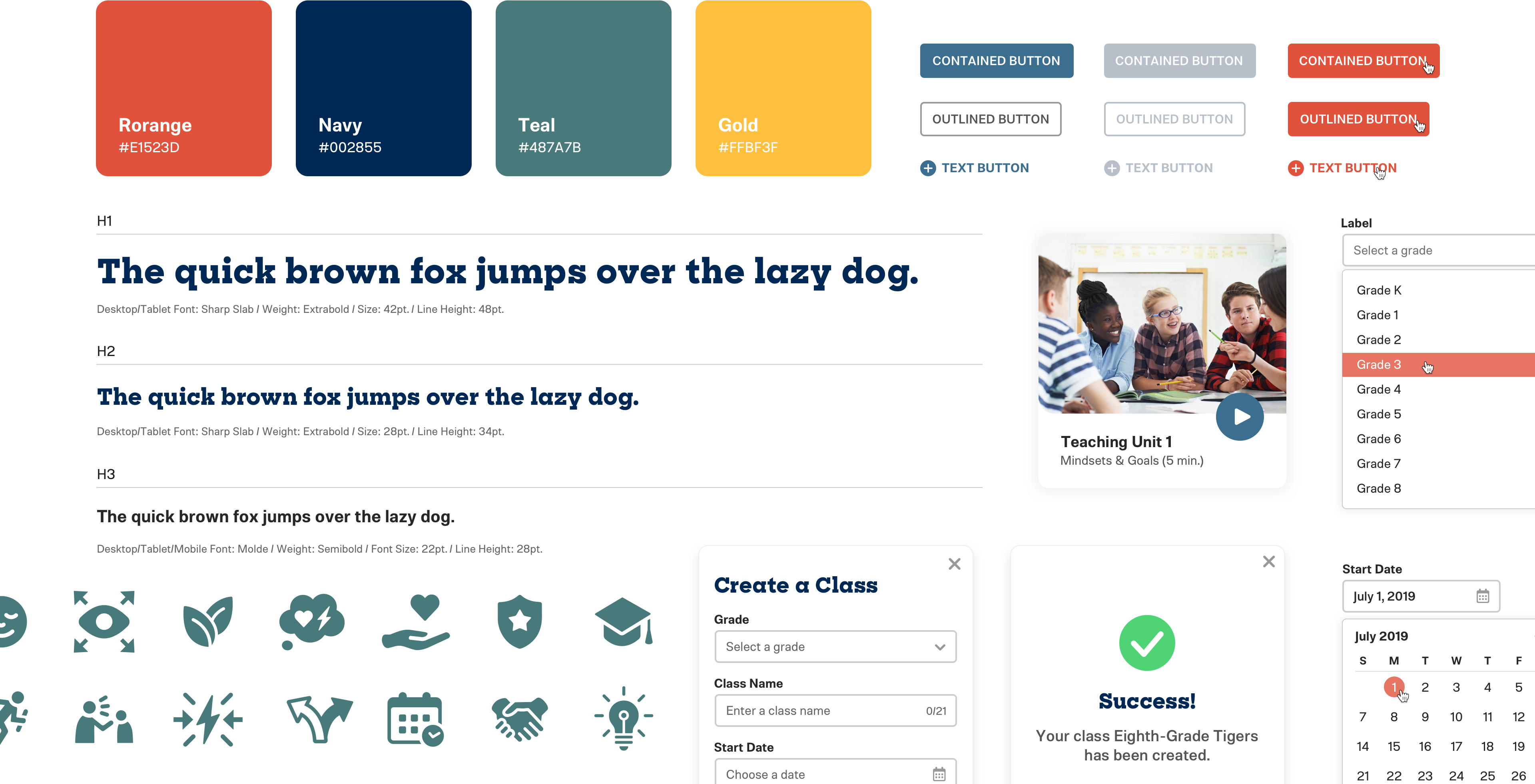
The Second Story App design was centered around the positioning and personality of the Second Story brand. In order to make sure of this, I concepted, designed, and tested several unique visual directions in the form of element collages consisting of key elements to demonstrate how the brand would come to life within the interface. Once the final design direction was chosen amongst key stakeholders the task was to create an extensive suite of components, accounting for all states and scenarios.
Speeding up the design process through a shared component library
The system was made up of foundational elements (ie: buttons, form elements, and icons) that can be used to build out more complicated experience components, templates, and pages. I organized the components, synced, and made them available to the design team through a Sketch Cloud Library. This allowed the design team to quickly create flows and designs using consistent pre-made, editable and flexible Sketch symbols, so they could focus on solving customer problems, and not re-designing the product over and over.
Creating and maintaining the Second Story application
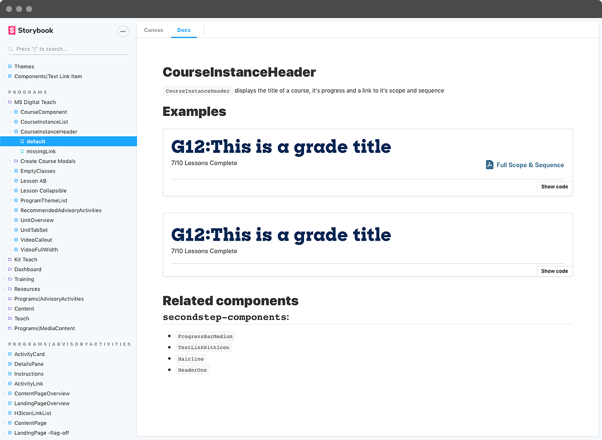
I worked with developers to standardize and implement code snippets for the components and establish clear guidelines for the creation of new components. I made sure that each component existing in the Sketch Library also existed as a React component documented in Storybook. Storybook provided an excellent way to share the design system with the entire team, gain feedback, and promote collaboration.
Although I initially defined and designed the system, today it’s being consumed and contributed to by every designer and developer across the company — being fully documented and maintained by a core group rather than a single gatekeeper.
