Telling a Unique Story
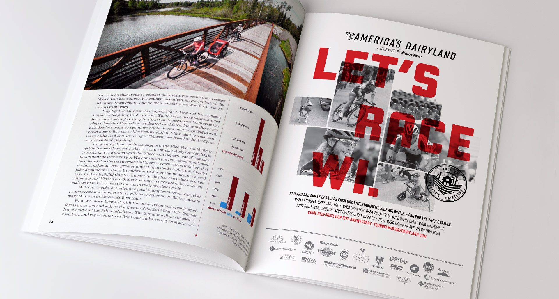
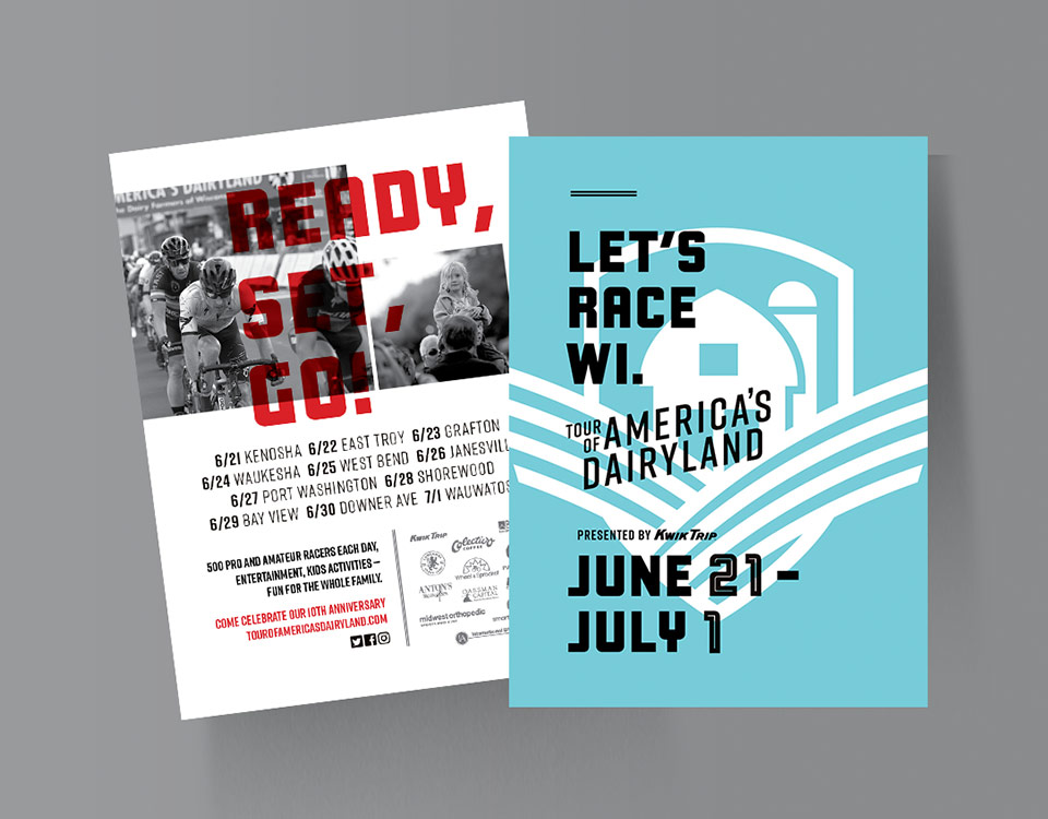
Reflecting the redefined position and personality of the Tour, we created a new brand style and identity system appealing to both racers and spectators. Helping to establish and create a culture for the Tour, the identity was based on telling the Tour’s unique story — combining the rich heritage of competitive cycling and the historical relevance of Wisconsin being referred to as America’s Dairyland. The new identity system offers multiple components that work together as a family to meet the diverse needs of the brand.
Let’s Race Wisconsin
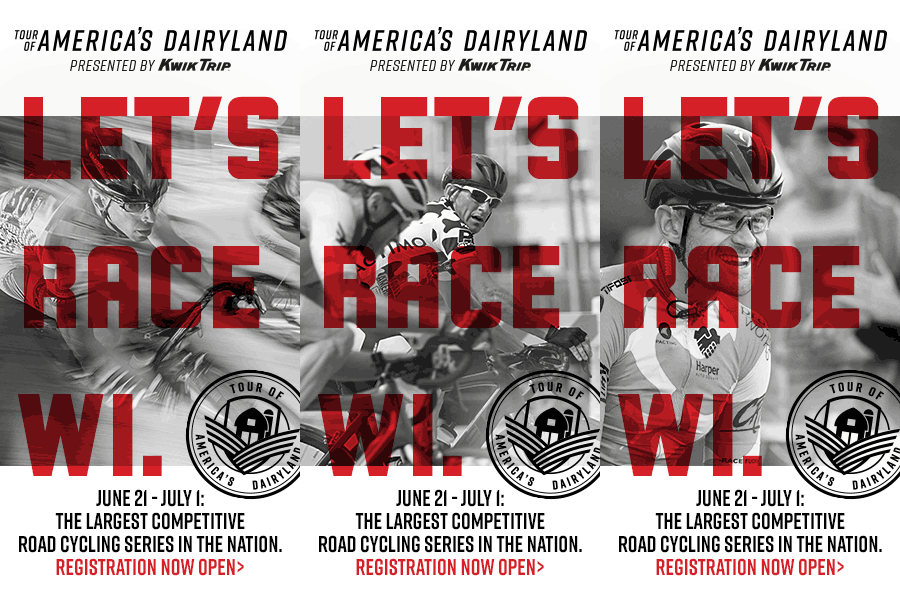
With the 2018 races fast approaching, marketing materials were developed to gain racer registration and help promote the tour locations and dates to spectators.


