

Challenge
The previous brand lacked cohesion and didn’t reflect the firm’s purpose of guiding clients toward confident financial decisions. The website and materials felt transactional and complex, which made the planning process feel overwhelming instead of supportive. They were also relying on third-party materials from several vendors, which created a disjointed experience that didn’t represent the quality of guidance the firm actually provided.
As a result, the brand and digital presence struggled to communicate the firm’s value and support a stronger experience for both new and existing clients. The challenge was to unify communication across the brand, simplify how information was presented, and design a digital experience that felt clear, approachable, and grounded in real client needs.
My Role
Led strategy, brand development, and the full digital experience from start to finish.
- Worked with the founder to define the brand’s position, promise, personality, and tone.
- Partnered with my design collaborator to develop the visual identity and brand standards.
- Designed the website experience, including information architecture, content structure, and key user flows.
- Collaborated with a copywriter, developer, SEO consultant, photographer, animator, and junior designer to bring the system to life.
Foundation
We began by uncovering the emotional and strategic core of the brand. Through conversations with the founder, it became clear that everything Wealth Partners stood for centered on one idea: guiding people toward confident financial decisions.
This idea shaped the brand’s purpose, personality, and tone. It became the organizing principle behind every visual, verbal, and interactive decision that followed, forming the foundation for the entire system.

Process
The identity began with the compass, a clear symbol of guidance and forward movement. The directional arrow points upward toward the North Star, representing each client’s individual financial goals and the firm’s commitment to helping them move toward clarity and confidence.
The arrow is built from three shapes that reflect the core parts of Wealth Partners’ approach to financial planning: banking, insurance, and investments working together as one path forward.
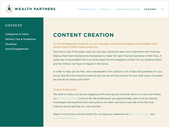
Brand Guidelines
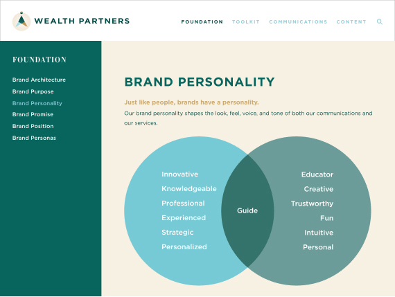
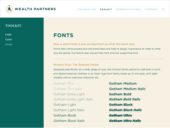
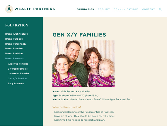
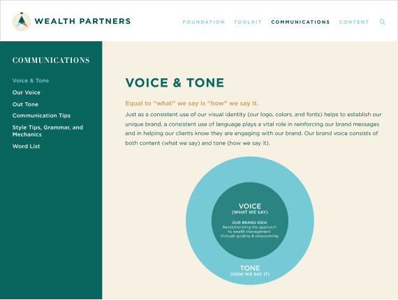
To ensure consistency and scale, we created an online brand standards site that brought the entire system together. It included Brand Foundation, Visual Toolkit, Communications, and Content Guidelines, along with audience personas to anchor the team in who they were designing and writing for. This helped keep the brand grounded in real client needs and made communication more relevant and empathetic.
The standards site became the single source of truth and made the brand easy to apply across digital, print, and in-person experiences.

Information Architecture
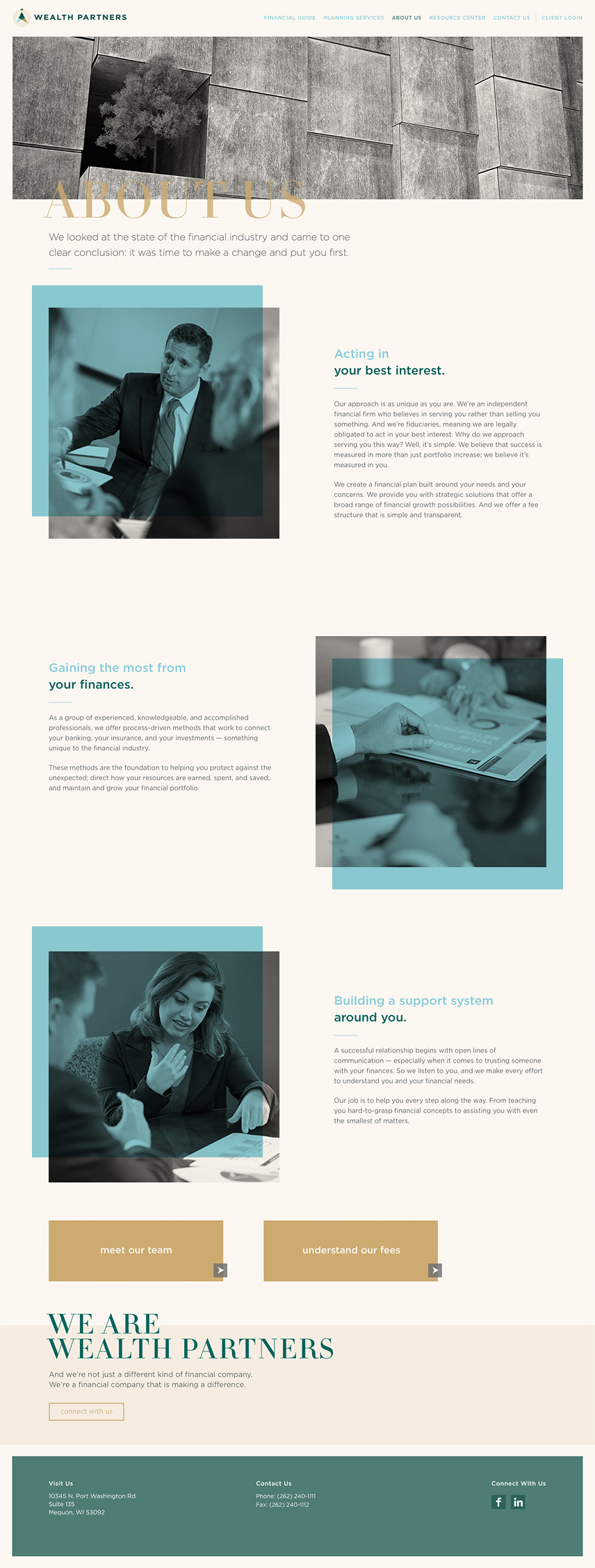
With the foundation in place, the next step was translating clarity and guidance into the structure of the website. The new site map reorganized the experience around how people actually think about their financial lives. It simplified navigation, grouped related topics, and created clear pathways through life events, financial milestones, and planning services.
The structure also made space for what clients cared about most when evaluating a financial partner. People wanted to understand the firm’s approach, meet the team, and learn how fees worked. Organizing the site around these needs made the experience feel more transparent and trustworthy from the start.

Wireframes
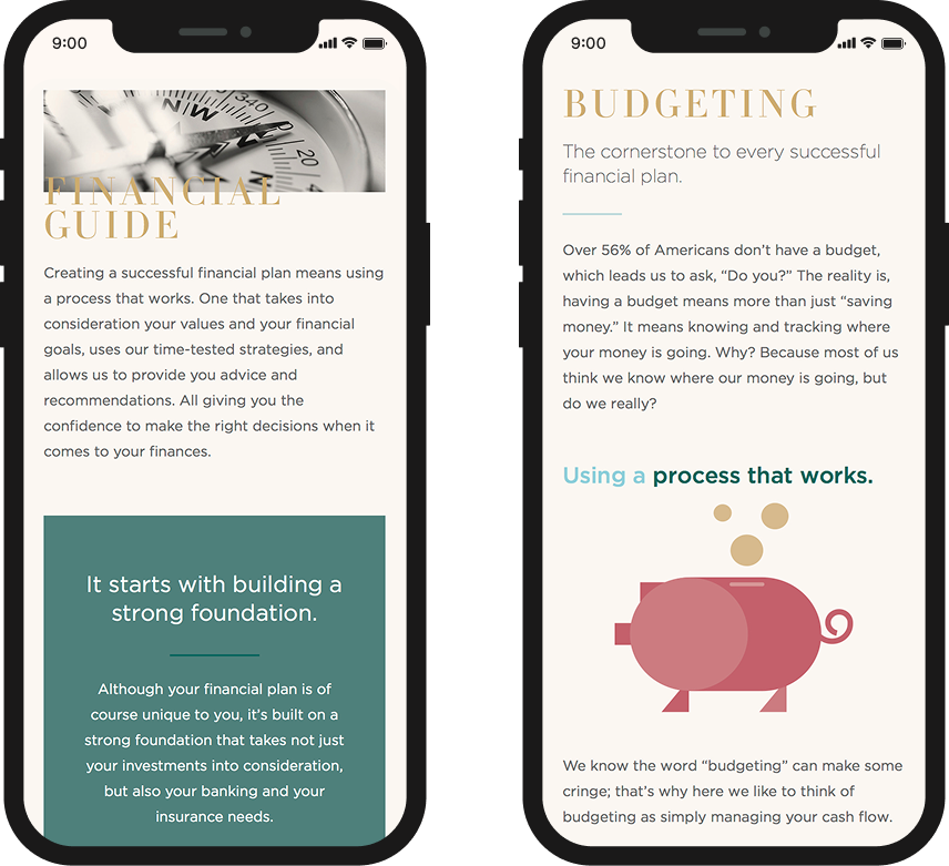
Wireframes established the hierarchy, flow, and content strategy for the core pages. Each layout was built to reduce cognitive load, making financial topics feel clear and approachable rather than intimidating. We treated the website as an educational ecosystem, not a brochure.
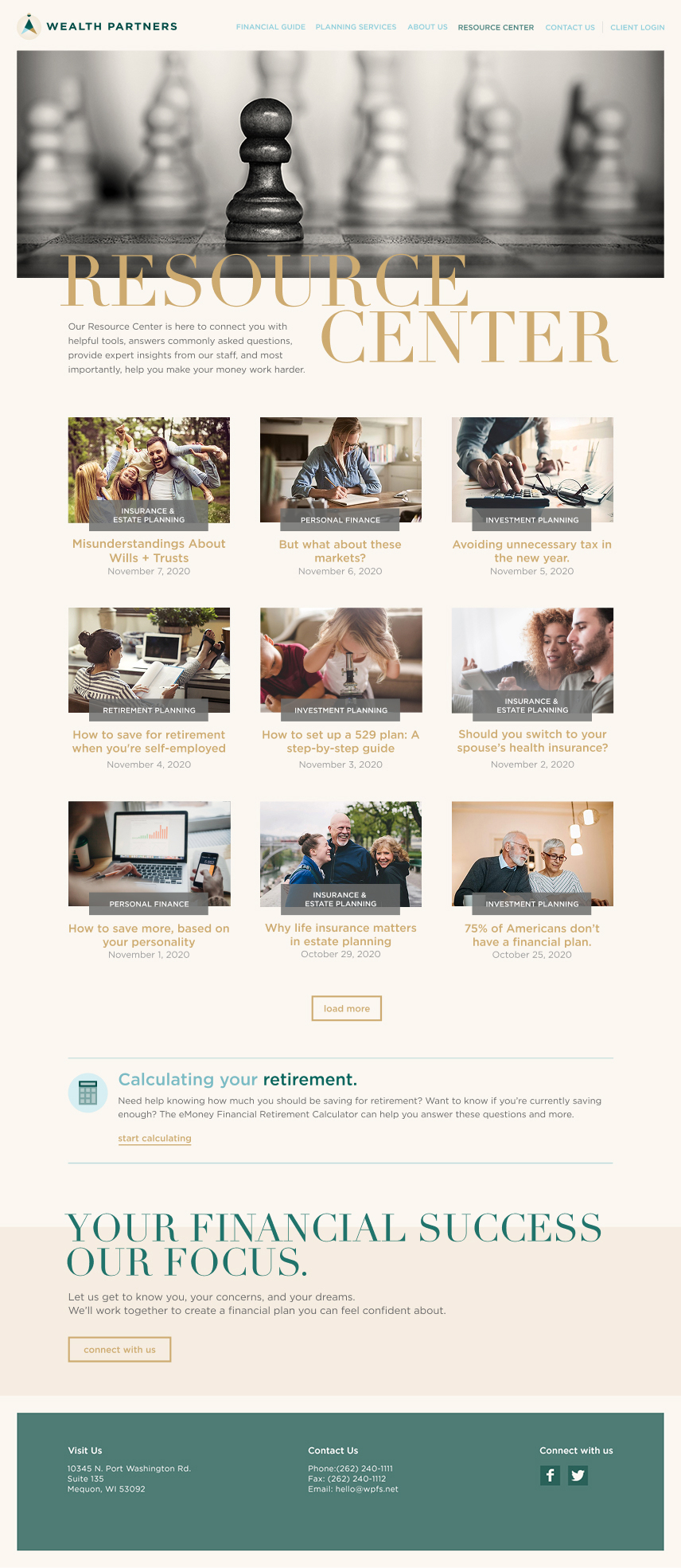
Key sections like Planning Services, the Financial Approach, and the Resource Center were structured to help people learn, compare options, and take action with confidence. These early structures shaped the full responsive system, defining how content scaled, how components adapted across viewports, and how the experience supported both new and returning clients.


Outcome
The new website brought the brand’s guiding promise to life through a clear and approachable digital experience. Every page was designed to feel calm, supportive, and focused on helping people take the next step in their financial journey. The responsive system balanced warmth and professionalism through typography, imagery, and modular components, while plain-language content replaced financial jargon to make information easier to understand and act on.
The site became both an educational platform and a conversion tool. It introduced the firm’s philosophy, services, and planning approach while offering a growing resource center for ongoing learning. The experience felt modern, trustworthy, and aligned with how people make decisions about their financial futures, giving the firm a digital foundation that could evolve as their needs and offerings grew.
Scalable System
To support long-term growth, the website was built with a modular system of content blocks and components. Each piece was designed to be flexible, reusable, and easy for the team to update while maintaining clarity and consistency.
Pages could be assembled from interchangeable modules like hero sections, content bands, image and text layouts, resource listings, and service highlights. This approach made the experience feel cohesive while giving the team the freedom to expand the site as their offerings evolved.


Workshops & Seminars
The brand extended beyond the website to the in-person workshops and seminars Wealth Partners leads. These sessions are a core part of how the firm educates clients, so the materials needed to reflect the same clarity and approachability as the digital system. We redesigned the workbooks, worksheets, and presentation templates to make financial concepts easier to understand and more engaging to follow.
The new materials used the same visual toolkit as the website, creating a unified experience whether someone was learning online or in a classroom setting. The result was a set of tools that supported meaningful conversations, helped advisors teach with confidence, kept participants engaged, and strengthened trust across every touchpoint.


Impact
Improved clarity and client confidence
The cohesive brand and website made financial topics easier to understand and helped clients feel more supported throughout their planning journey.
A more trusted and professional presence
Consistent branding across digital and in-person experiences elevated how the firm showed up in meetings, workshops, and first impressions.
A streamlined and scalable website
Modular content blocks and a flexible structure made it easier for the team to maintain the site, publish new content, and evolve their services over time.
Stronger engagement through education
The Resource Center, planning pages, and seminar materials worked together as an educational ecosystem, helping the firm share knowledge and stay connected with clients.